
About Me
Hi! I'm Miroslav Kopac, and I'm a Data Analyst 👋🏻
I create reports and visualizations to help data-driven companies make smarter decisions
Skills

Excel | SQL | Tableau | Sig Sigma
Process Optimization
Data Analysis & Reporting
Change management
Strategic Planning
Cross-Cultural Communication
Lean Management
Featured Projects
Excel
Revenue Analysis Dashboard
I built an interactive Excel dashboard from a downloaded database using Pivot Tables and Charts for clear, concise data insights.
SQL | Looker Studio
Business Performance
The owner requires to design and build relational database that allows him to capture and store all of important information and data that the business generates. This will help him to monitor business performance in dashboards
ChatGPT| Python | Tableau
Human Resources Dashboard
This HR Dashboard project uses synthetic employee data from ChatGPT prompts and the Python Faker library to simulate realistic HR metrics for Tableau analysis and visualization.
Tableau
Sales Dashboard
Two dashboards created to analyze sales and customer performance
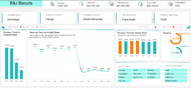
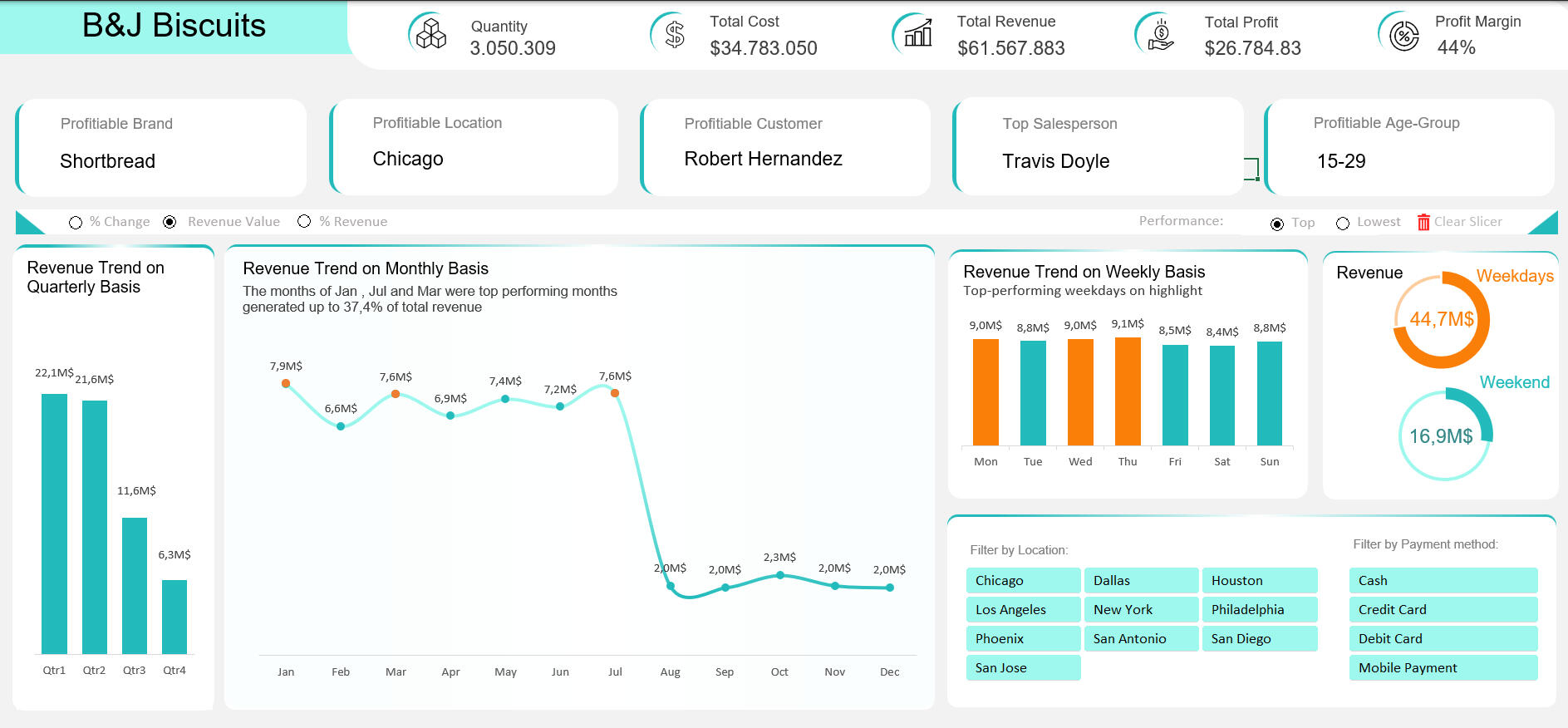
Excel | B&J Biscuit Business Analysis
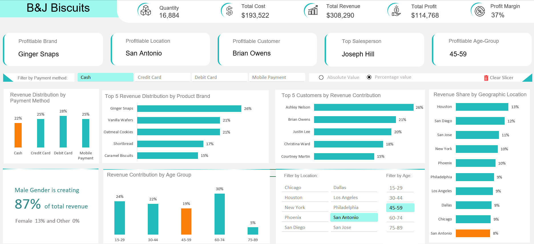
Project Overview
An interactive Excel dashboard created to provide comprehensive business insights for B&J Biscuit, focusing on revenue distribution, profitability analysis, and customer demographics. The dashboard enables data-driven decision-making through dynamic visualizations and flexible filtering options.
Here are the points I was interested in answering:
1. Where is the revenue coming from?
2. What drives the highest profits?
3. Who are the most valuable customers?
4. How does revenue vary by location?
5. What are the key sales metrics telling us?
I took the following steps to create my analysis:
1. Download the data from Kaggle, cleaning it, and preparing it for analysis.
2. Creating charts and placing them in the dashboard tab.
3. Utilizing pivot tables to aggregate KPIs at the top of the page.
4. Creating slicers and syncing all tables together for filtering.
5. Formatting all sections of the dashboard and creating an overall theme.
Here are my key takeaways:
1. Revenue Drop: A 73% dip from July to August needs urgent review—possible causes include website, delivery, or stock issues.2. Customer Demographics: 84% of revenue comes from male buyers—targeted campaigns can unlock growth in the female segment.3. Ad Strategy: Use insights from top 10 female spenders to tailor ads.4. Top Product: Shortbread leads in 9 of 10 states—strong case for focused promotion.
The dashboard is completely dynamic
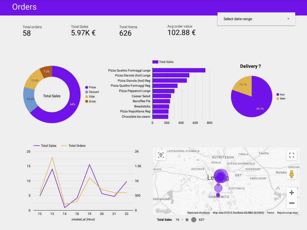
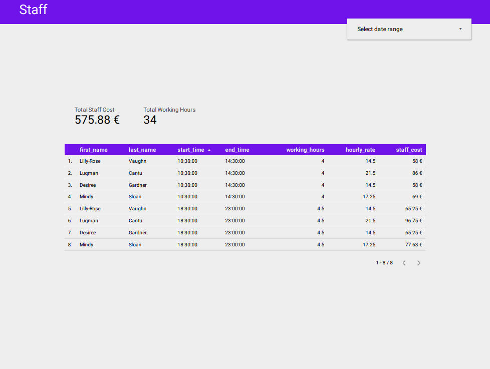
SQL | Looker Studio
Business Performance

Project Overview
New Pizza Store is running takeout and delivery business. The owner requires to design and build relational database that allow him to capture and store all of important information and data that the business generates. This will help him to monitor business performance in dashboards
This report responds to the client's needs:
1. Customer orders information
2. When it’s time to order new stock
3. Which staff members are working when
4. The staff salary information
I took the following steps to create my analysis:
1. Designed and built a mock-up
2. Collected and normalized data
3. Defined table relationships and created a relational database using this website
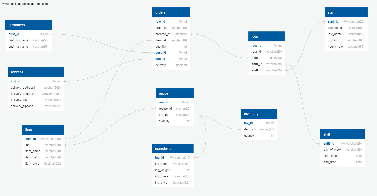
Relational database
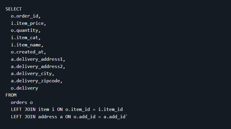
4. Created all queries using SQL (View SQL Queries on my Github)
To create orders dashboard, I need to query all necessary information from the order, item, and address tables, which are connected via IDs.
5. Visualized dashboards in Looker Studio using CSVs from queries
Developed an inventory optimization system based on real-time order patterns and stock levels, ensuring timely reordering and eliminating the risk of stockouts for the client
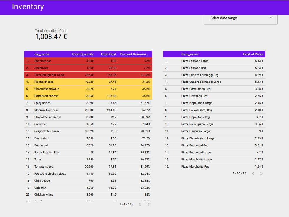
Created a staff management system to see who is working and to keep track of their salaries.
Thanks!
Thank you for taking the time to visit my portfolio!
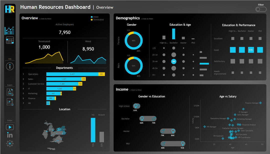
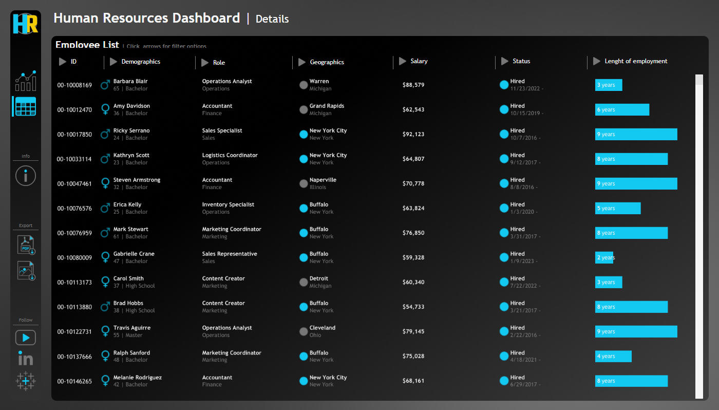
ChatGPT| Python | Tableau
Human Resources Dashboard
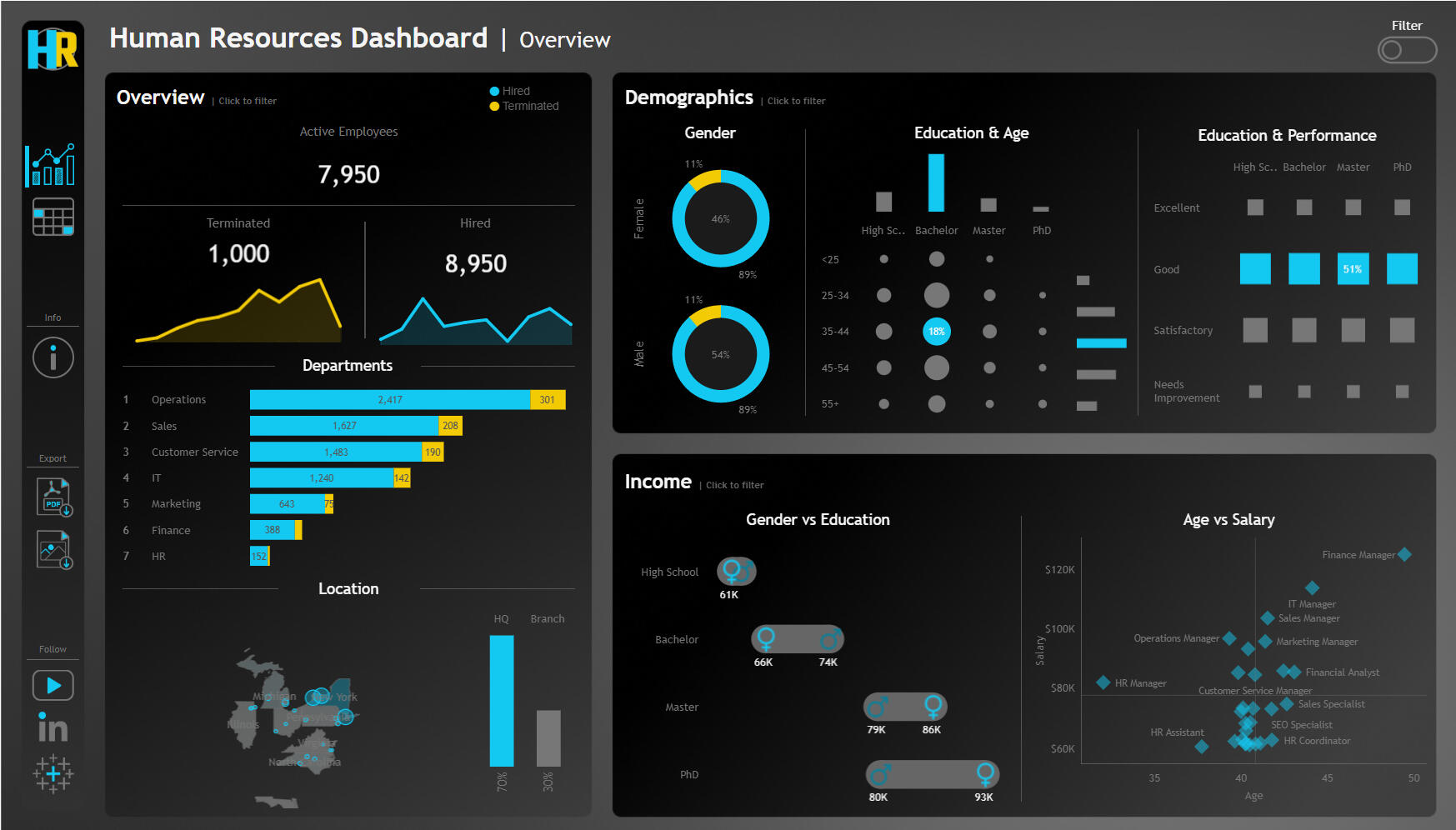
Project Overview
This HR Dashboard project uses synthetic employee data generated with ChatGPT prompts and the Python Faker library to simulate realistic HR metrics for analysis and visualization in Tableau.
Here are the points I was interested in answering:
1. How has employee hiring and termination trended over the years?
2. What is the current distribution of employees by department, job title, and location?
3. What does the workforce demographic look like in terms of gender, age, and education?
4. Is there a relationship between education level and employee performance?
5. How do salaries vary by age, gender, education, and department?
I took the following steps to create my analysis:
1. Generated realistic HR data using Python's Faker library + ChatGPT
2. Used Draw.io to plan visualization layout and user experience and Figma to enhance visualization
3. Created 9 different chart types for diverse data storytelling
4. Designed intuitive data visualizations in Tableau
5. Developed both executive summary views and detailed employee analysis
Here are my key takeaways:
1. 20% of all terminations in the last 10 years occurred in 2020 —what might have driven this spike?
2. 70% of employees are based in HQ, with similar departmental distribution.
3. Gender balance is healthy; age distribution is normal and aligns with company culture.
4. 61% hold bachelor’s degrees, but high school grads show equal performance at lower cost—worth hiring more.
5. IT shows the most balanced salaries, while in Sales, women with PhDs earn 14K more than men despite no significant difference in performance—this warrants a closer review.
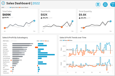
Tableau
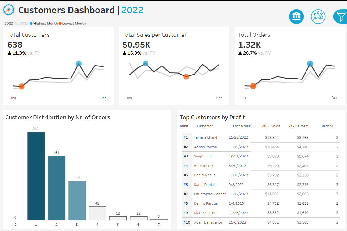
Sales & Customer Dashboard
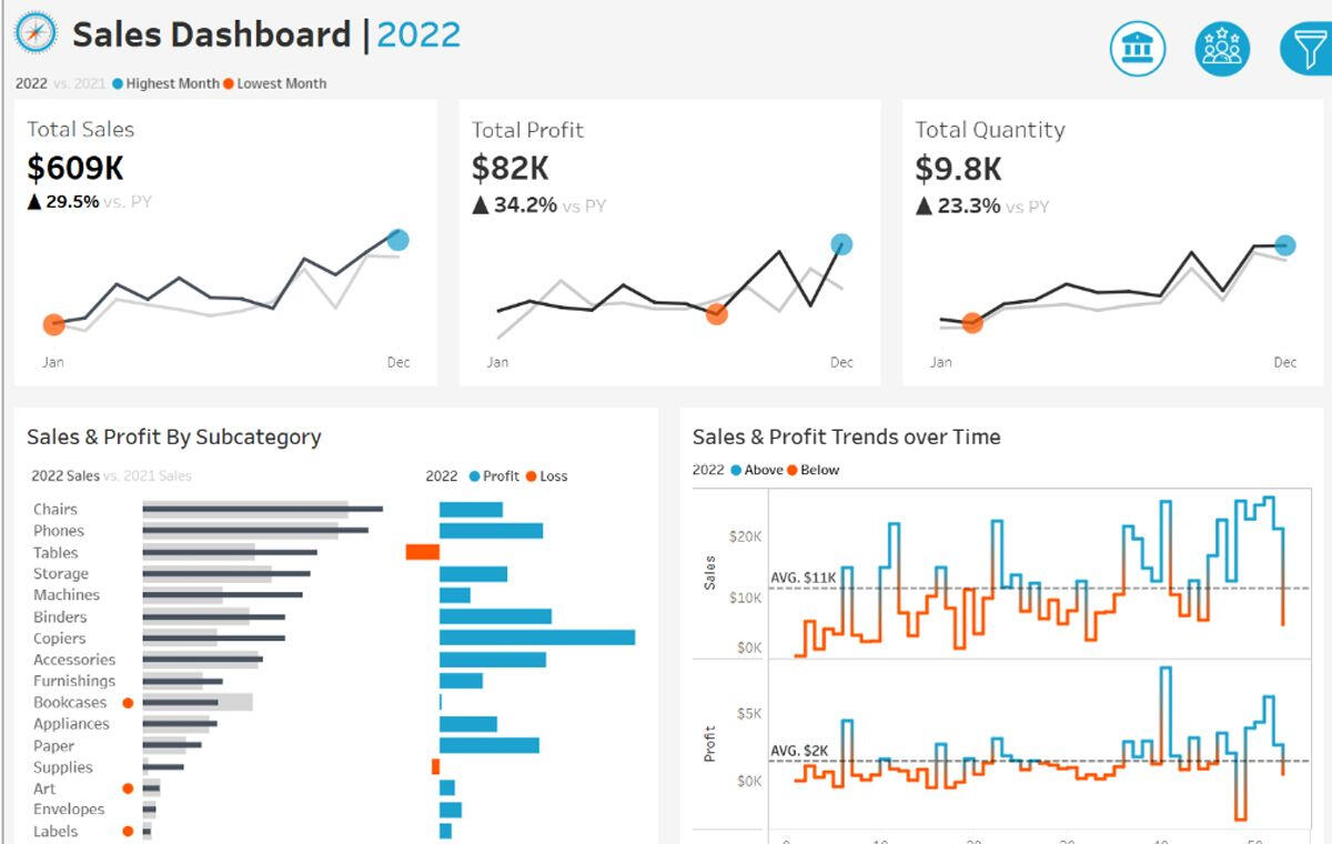
Project Overview
The purpose of sales dashboard is to present an overview of the sales metrics and trends in order to analyze year-over-year sales performance and understand sales trends.
The customer dashboard aims to provide an overview of customer data, trends and behaviors. It will help marketing teams and management to understand customer segments and improve customer satisfaction.
Here are the points I was interested in answering:
1. Total sales, profits and quantity for the current year and the previous year
2. Identifying months with highest and lowest sales
3. Comparing sales performance by different product subcategories
4. Weekly sales and profit data identifying weeks that are above and below the average
5. What is the distribution of customers based on the number of orders they have placed to provide insights into customer behavior, loyalty and engagement
6. The top 10 customers who have generated the highest profits
I took the following steps to create my analysis:
STEP 1 – Analyzed Requirements
Collected Requirements
Chose the Right Chart
Drew Mockups
Chose Colors
STEP 2 – Built Data Source
Connected Data
Created Data Model
Renamed Fields & Tables
Checked Data Types
Understood Data
STEP 3 – Built Charts
Created Calculated Fields & Tested
Built Chart
Formatted
Removed Lines and Grids
Cleaned up Axis and Headers
Applied Coloring
Added Tooltips
STEP 4 – Built Dashboard
Drew Mockup for Containers
Created Container Structure
Assembled All Charts
Formatted
Distributed Objects Evenly
Formatted Colors, Size, etc.
Set to "Entire View"
Added Legends
Added Spaces (Inner/Outer Padding)
Added Filters & Dynamic Elements
Added Icons
Here are my key takeaways:
1. Sales consistently grow through Q2–Q4 but drop sharply in Q1 each year, likely due to seasonal slowdowns and lack of targeted promotions. Launching year-end campaigns and loyalty incentives could help sustain momentum.2. Tables have not generated any profit over the past four years, consistently operating at a loss. Selling them as part of bundled sets with chairs or repositioning them in marketing could help turn this category around.3. Copiers are the most profitable subcategory. They should be prioritized in marketing and bundled with service plans to maximize revenue.4. The introduction of subscriptions led to more repeat customers and larger orders. Expanding subscription options and creating tiered benefits can further improve loyalty and revenue.